Evidently Has Rebranded.
Evidently recently moved into their new London-based office and saw it as a perfect time to rebrand, redesign, and reestablish.
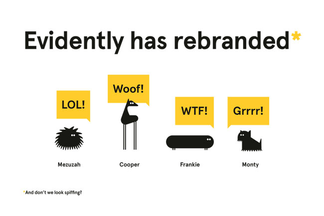
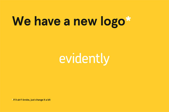
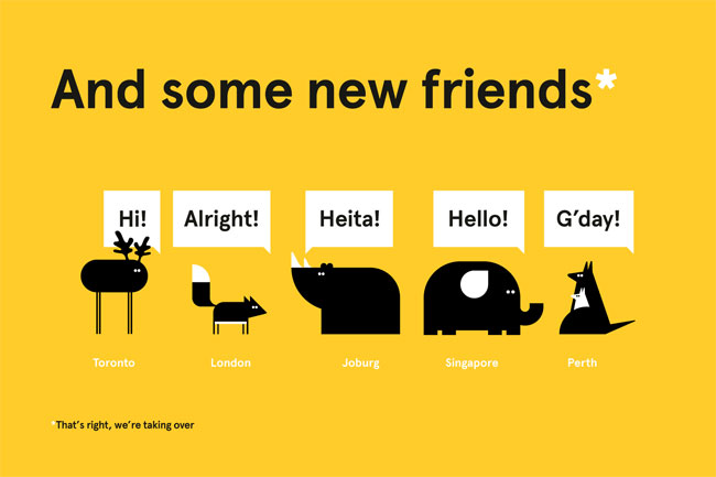
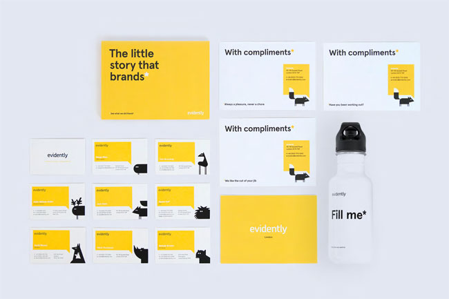
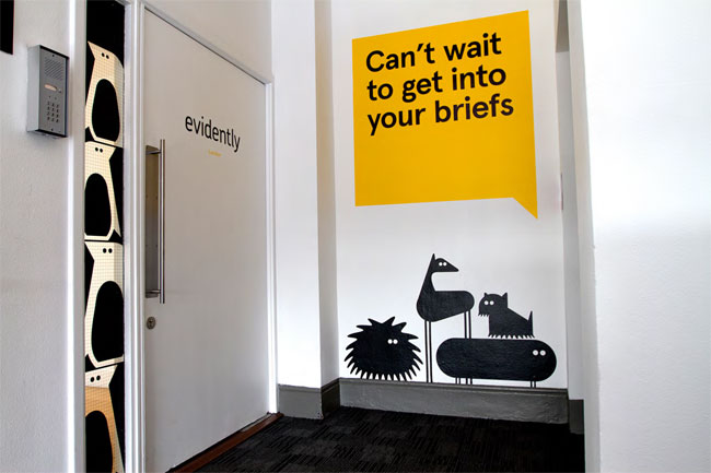
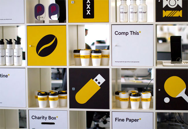
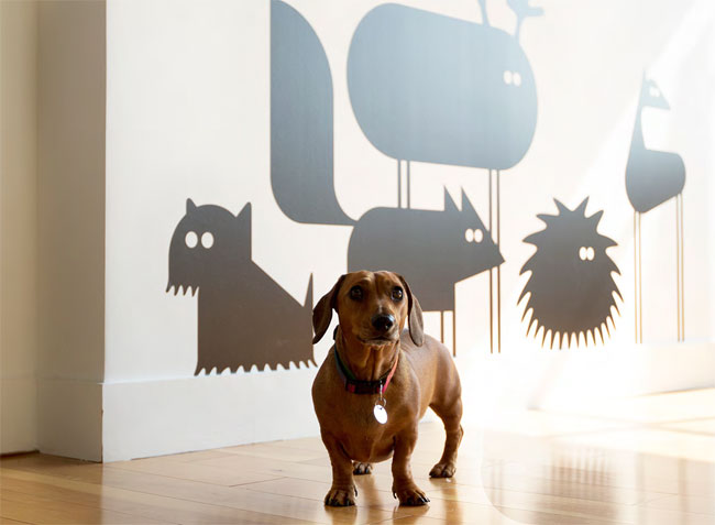
"We saw our move into our new London office as the perfect time to evolve our agency collateral, taking time to refresh design elements that still worked well – such as our logotype, set in Chevin, coupled with our minimal palette centred around yellow, that we deemed integral to our brand – with a new character set (originally inspired by our four lovely office dogs) and copy style that features quirky, irreverent brand statements and asides set in Apercu, a versatile typeface fromColophon. The project was pushed through quickly in line with our move to our new premises, starting in December 2012 and live in March 2013, but we’re adding new elements all the time, not least new brand characters."